Design Tokens, CSS Variables, and Dark Mode: How to Build a Colour System That Scales
Design tokens are a three-tier hierarchy: primitive colours → semantic meanings → component-specific use. CSS custom properties implement this at runtime, making dark mode a one-place change. Here's the full token model, how Tailwind's colour system works, and why OKLCH is replacing HSL for design systems.
By sadiqbd · June 12, 2026

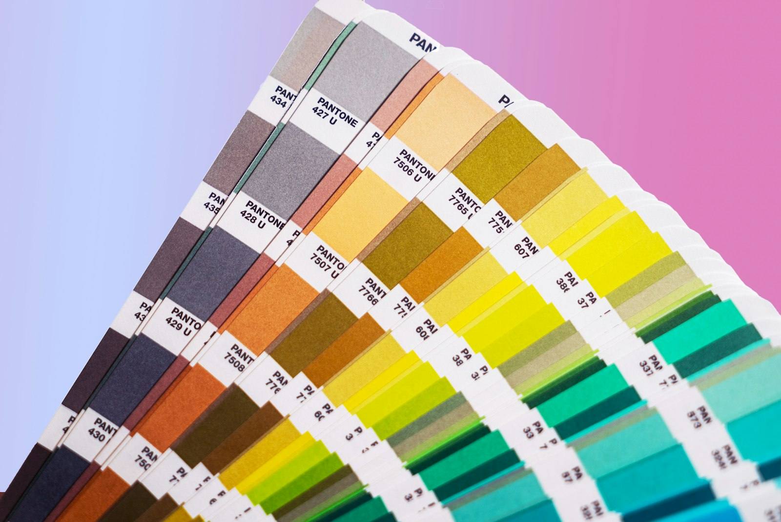
Design tokens turn a colour palette into a system — and CSS variables are how you implement that system
A colour palette is a list of colours. A colour design token system is a hierarchy of decisions: primitive colours at the base, semantic meanings layered on top, component-specific usage at the leaves. The difference is the difference between "we have these 40 colours" and "this specific colour is the error state background for destructive action buttons."
CSS custom properties (CSS variables) are the technical implementation layer that makes design tokens work in production code.
The three-tier design token model
Tier 1 — Primitive tokens (the palette): Raw colour values without semantic meaning. Named by value.
:root {
  --color-blue-50: #eff6ff;
  --color-blue-100: #dbeafe;
  --color-blue-200: #bfdbfe;
  --color-blue-300: #93c5fd;
  --color-blue-400: #60a5fa;
  --color-blue-500: #3b82f6;
  --color-blue-600: #2563eb;
  --color-blue-700: #1d4ed8;
  --color-blue-800: #1e40af;
  --color-blue-900: #1e3a8a;
  --color-blue-950: #172554;
}
Tier 2 — Semantic tokens (meaning): Map primitive colours to semantic purposes. Named by function.
:root {
  --color-action-primary: var(--color-blue-600);
  --color-action-primary-hover: var(--color-blue-700);
  --color-action-primary-disabled: var(--color-blue-300);
  --color-background-default: var(--color-white);
  --color-background-subtle: var(--color-blue-50);
  --color-text-primary: var(--color-gray-900);
  --color-text-secondary: var(--color-gray-600);
  --color-text-disabled: var(--color-gray-400);
  --color-border-default: var(--color-gray-200);
  --color-status-error: var(--color-red-600);
  --color-status-success: var(--color-green-600);
  --color-status-warning: var(--color-yellow-500);
}
Tier 3 — Component tokens (specific use): Map semantic tokens to specific components.
:root {
  --button-primary-bg: var(--color-action-primary);
  --button-primary-bg-hover: var(--color-action-primary-hover);
  --button-primary-text: var(--color-white);
  --input-border: var(--color-border-default);
  --input-border-focus: var(--color-action-primary);
  --input-bg-disabled: var(--color-background-subtle);
}
Why the hierarchy matters
Without semantic tokens, theming requires changing individual component values:
/* Without design tokens — change brand colour = change hundreds of rules */
.button-primary { background-color: #2563eb; }
.link { color: #2563eb; }
.input:focus { border-color: #2563eb; }
.badge-primary { background-color: #2563eb; }
/* ...hundreds more rules... */
With semantic tokens, changing the brand colour requires changing one primitive token:
/* With design tokens — change one value */
:root {
  --color-blue-600: #7c3aed; /* Purple rebrand */
}
/* Everything that references --color-action-primary updates automatically */
Dark mode with CSS variables
The semantic token layer makes dark mode straightforward. Light and dark modes map to different primitive values:
/* Light mode (default) */
:root {
  --color-background-default: #ffffff;
  --color-background-subtle: #f8fafc;
  --color-text-primary: #0f172a;
  --color-text-secondary: #475569;
  --color-border-default: #e2e8f0;
}

/* Dark mode override */
@media (prefers-color-scheme: dark) {
  :root {
    --color-background-default: #0f172a;
    --color-background-subtle: #1e293b;
    --color-text-primary: #f1f5f9;
    --color-text-secondary: #94a3b8;
    --color-border-default: #334155;
  }
}

/* Or via class (for user toggle) */
[data-theme="dark"] {
  --color-background-default: #0f172a;
  /* ... */
}
Component code never changes — only the token values change between modes.
Tailwind CSS's colour system
Tailwind implements a primitive token palette with named scales (slate, gray, zinc, neutral, stone for neutrals; red, orange, amber, yellow, lime, green, emerald, teal, cyan, sky, blue, indigo, violet, purple, fuchsia, pink, rose for colours).
Each scale runs from 50 (lightest) to 950 (darkest). This produces approximately 220 named colour values.
In Tailwind config, custom design tokens:
// tailwind.config.js
module.exports = {
  theme: {
    extend: {
      colors: {
        'brand-primary': {
          DEFAULT: '#2563eb',
          hover: '#1d4ed8',
          light: '#eff6ff',
        },
        'status-error': '#dc2626',
        'status-success': '#16a34a',
      }
    }
  }
}
This enables bg-brand-primary, text-brand-primary-hover, etc.
OKLCH: the modern colour space for design tokens
HEX and RGB define colours in an RGB cube — a device-dependent space where "perceptually similar" colours aren't geometrically similar. Adjust hue in HSL and lightness changes unexpectedly.
OKLCH (Lightness, Chroma, Hue) is a perceptually uniform colour space:
- Lightness is truly perceptual — L=50 looks equally bright across all hues
- Adjusting hue doesn't change perceived brightness
- Better for generating accessible colour scales where contrast ratios are predictable
:root {
  /* Same lightness, different hue — perceptually equally bright */
  --color-blue-500: oklch(60% 0.2 255);
  --color-green-500: oklch(60% 0.2 145);
  --color-red-500: oklch(60% 0.2 25);
}
CSS Color Level 4 supports OKLCH natively in all modern browsers. Design tools (Figma, Radix, Linear's design system) are adopting it.
How to use the Colour Converter on sadiqbd.com
- Enter any colour — HEX, RGB, HSL, HSV, or CMYK
- Convert across formats — get all representations for the same colour
- Build a token palette — start with brand colours in HEX, convert to HSL for generating variations programmatically
- Verify contrast — use the RGB values with the WCAG contrast formula (covered in the accessibility post)
Frequently Asked Questions
When should I use CSS custom properties vs SCSS variables? SCSS variables are compiled at build time and produce static values in the output CSS. CSS custom properties exist at runtime in the browser, can be changed with JavaScript, cascade through the DOM, and are recalculated when their values change. Use SCSS variables for design system build tooling; use CSS custom properties for runtime theming, dark mode, and values that need to change dynamically.
How do design tokens get from Figma to code? Tools like Tokens Studio (Figma plugin) export design tokens as JSON. Style Dictionary (Amazon open-source tool) transforms those JSON tokens into CSS variables, SCSS, iOS swift constants, Android XML, and any other format needed. This creates a single source of truth in Figma that propagates to all platforms.
Is the Colour Converter free? Yes — completely free, no sign-up required.
Try the Colour Converter free at sadiqbd.com — convert between HEX, RGB, HSL, HSV, and CMYK with a live colour preview.


