Why the Same Color Looks Different on a MacBook vs a Standard Monitor — Color Spaces, P3, and oklch
P3 displays (iPhone, MacBook Pro) can show colors that are impossible to display on standard sRGB monitors — and designers working on P3 screens routinely create colors that look different (less vivid) for much of their audience. Here's what "color space" actually means (gamut + encoding), why the same RGB value looks different on sRGB vs P3 displays, how CSS Color Level 4's color() function handles wide gamut, and why oklch is replacing HSL for building perceptually consistent color systems.
By sadiqbd · June 18, 2026
The P3 color space — used in modern iPhone and Mac displays — can represent colors that are simply impossible to display on a standard sRGB monitor, which means designers working on wide-gamut displays are routinely creating colors that will look different (usually less vivid) for a large portion of their audience
The previous articles on this site covered color model basics (HEX/RGB/HSL/CMYK), WCAG contrast ratios, design tokens and dark mode, and color blindness design. This article addresses color spaces and gamut — the reason that "the same RGB value" can look different on different screens, and what wide-gamut color management means for web and digital design.
What "color space" actually means
A color space defines two things:
- The gamut — the range of colors that can be represented
- The encoding — how numerical values (like RGB 255, 128, 0) map to actual physical light output
The same RGB value (255, 128, 0) appears different on a sRGB monitor and a P3 monitor — not because the numbers mean something different in some abstract sense, but because the underlying gamut is different. The P3 color space defines "maximum red" as a different actual wavelength and intensity than sRGB's "maximum red."
sRGB (standard Red Green Blue) was standardized in 1996 as the color space for monitors and the web. It defines specific primary colors (the redness of the "red" channel, the greenness of the "green," etc.) that corresponded to the display technology of that era.
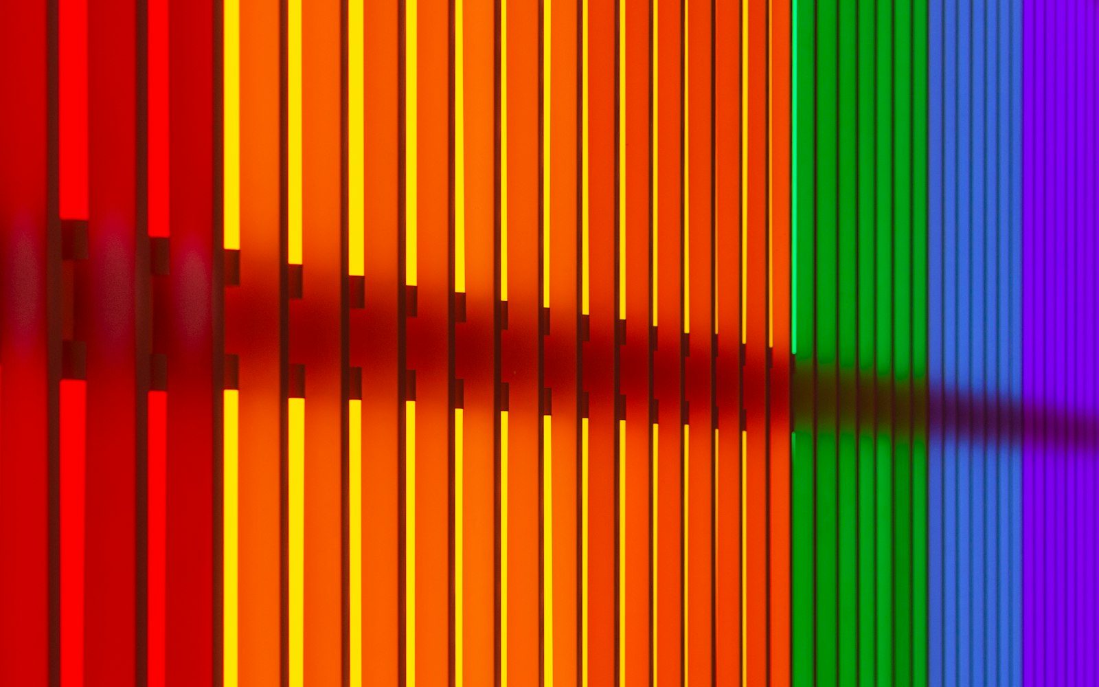
Display P3 is a wider-gamut color space used in Apple displays (iPhone cameras and screens, MacBook Pro, iMac). Its primaries are different from sRGB — "maximum red" in P3 is a more saturated, vibrant red than sRGB's "maximum red." The P3 gamut is approximately 26% larger than sRGB.
What this means for a CSS value like rgb(255, 0, 0)
In the traditional web model: rgb(255, 0, 0) is interpreted as sRGB red — the reddest red the sRGB color space defines.
On a P3-capable display with proper color management: the browser can produce a more vivid red than sRGB's maximum. rgb(255, 0, 0) still displays sRGB red (limited by what the rgb() value can encode), but the display could show more vivid colors — colors that sRGB values can't represent.
The CSS Color Level 4 specification introduced color() function syntax to address this: color(display-p3 1 0 0) specifies a P3-gamut red — which on a P3 display looks noticeably more vivid than rgb(255, 0, 0), and on a sRGB-limited display is automatically mapped to the nearest representable color (the sRGB red maximum).
Color gamut in photography vs design
Photographs captured on iPhone cameras are in Display P3 color space — the camera captures a wider range of colors than sRGB. When these photos are viewed on P3-capable displays, they show the full vibrant colors. When viewed on sRGB-limited displays, the colors are "tone-mapped" down — resulting in slightly less vivid blues, reds, and greens.
For designers using P3 display photos in their work: a product photo of a vibrant orange packaging, captured in P3 and displayed on a MacBook Pro, looks vivid. The same photo on a standard office monitor with an sRGB display panel looks slightly duller. The design created on the P3 MacBook won't look the same on the client's Windows laptop with an sRGB panel — a color accuracy problem invisible within the MacBook environment.
The practical workflow for cross-device compatibility: convert photos to sRGB when content must look consistent across a wide range of display types, and test designs on sRGB-limited displays before finalizing.
CMYK and print color spaces
CMYK (Cyan, Magenta, Yellow, Black) — the color model for print — covers a different gamut than sRGB. Some colors within sRGB cannot be reproduced in CMYK (highly saturated blues and greens are commonly "out of gamut" for print), and some printable colors (certain rich browns, deep neutrals) are outside sRGB.
A color that looks vibrant on screen may print disappointingly muted — this is the print-to-screen gamut mismatch. Professional print workflows use color management profiles (ICC profiles) to accurately predict how a color will print, allowing designers to see a "print preview" on screen that simulates the print output.
A web-focused color converter showing CMYK values is useful for understanding approximate print equivalents, but should not be used for professional print production without proper ICC-profile-based color management — simple mathematical CMYK conversion doesn't account for the paper, ink, and press characteristics that affect actual print output.
The oklch color space: the perceptual future of web color
oklch (OK Lightness-Chroma-Hue) is a recent color space gaining adoption in web design tools and CSS. Its key property is perceptual uniformity — equal numerical changes in lightness, chroma (saturation), or hue correspond to equal perceived changes in the color.
HSL is not perceptually uniform: HSL lightness 50% for a pure yellow (hsl(60, 100%, 50%)) looks very bright; HSL lightness 50% for a pure blue (hsl(240, 100%, 50%)) looks much darker. The numerical lightness value doesn't match perceived brightness.
oklch fixes this: oklch L=0.5 (50% lightness) looks approximately equally bright regardless of hue — making it possible to programmatically generate accessible, visually consistent color palettes by adjusting lightness values predictably.
CSS now supports oklch natively and design tools (Figma, with plugins; Tailwind CSS 4) are adopting it. For designers building systematic color scales, oklch provides a more principled foundation than HSL.
How to use the Color Converter on sadiqbd.com
- For web design: convert between HEX/RGB/HSL as needed for CSS — be aware that these values are implicitly sRGB; for P3-gamut colors, the CSS
color(display-p3 ...)syntax is needed but not all tools support it yet - For print work: use CMYK values as a rough reference but verify with your print provider's ICC profiles and do physical print proofing before finalizing; simple RGB→CMYK conversion doesn't account for substrate and printing process
- When building color systems: consider oklch values (even if your current tools don't natively output them) — equal lightness steps in oklch produce perceptually consistent contrast relationships that HSL-based scales don't
Frequently Asked Questions
If a color is "out of gamut" for a display or print process, what actually happens to it? It gets "clipped" or "tone-mapped" to the nearest representable color. For displays, the browser or OS color management system converts an out-of-gamut color to the nearest representable color within the display's gamut — which means the vivid P3 orange on a MacBook Pro becomes a slightly less vivid sRGB orange on a standard monitor. For print, an out-of-gamut sRGB blue prints as the nearest CMYK blue, which is usually less vivid. In both cases, the transformation is handled automatically by color management systems — you don't see an error, you just see a different (usually less saturated) color than intended.
Is the Color Converter free? Yes — completely free, no sign-up required.
Try the Color Converter free at sadiqbd.com — convert colors between HEX, RGB, HSL, HSV, and CMYK instantly.
