Color Blindness and Design: Why Redundant Signals Matter More Than "Colorblind-Safe" Palettes Alone
Roughly 1 in 12 men have some form of red-green color vision deficiency — meaning "red means error, green means success" relies on a color distinction that's specifically the hardest for the most common type of color blindness. Here's how different CVD types affect color perception differently, why redundant non-color signals (icons, labels, patterns) are the core fix, and how CVD simulation reveals confusable color pairs during design review.
By sadiqbd · June 13, 2026
Roughly 1 in 12 men and 1 in 200 women have some form of color vision deficiency — meaning a "red means error, green means success" interface design is, for a meaningful fraction of any audience, displaying two colors that look nearly identical
The previous article on this site covered color contrast and WCAG ratios for luminance-based accessibility. This article addresses a different dimension of color accessibility: color vision deficiency ("color blindness") — which affects hue perception specifically, independent of contrast ratios — and why "the colors have enough contrast" doesn't mean "the colors are distinguishable for everyone."
Color vision deficiency: more common than many people realize
Color vision deficiency (CVD) — commonly called "color blindness," though this term can suggest (inaccurately) a total absence of color perception, which is extremely rare — typically involves difficulty distinguishing certain colors, not an inability to see color at all.
Prevalence varies by type and by population, but red-green color vision deficiencies (the most common category) affect a substantial proportion of men (commonly cited figures are in the range of roughly 1 in 12, i.e., approximately 8%, though specific figures vary somewhat by population/study) — and a much smaller proportion of women (commonly cited around 1 in 200, reflecting the X-linked genetic inheritance pattern of most red-green CVD types).
For any design intended for a general audience — these prevalence figures mean a meaningful percentage of viewers may have some difficulty distinguishing colors that appear clearly different to someone with typical color vision.
Types of color vision deficiency: not just "can't see red"
Deuteranomaly/deuteranopia (reduced sensitivity to, or absence of, green-detecting cone cells) and protanomaly/protanopia (reduced sensitivity to, or absence of, red-detecting cone cells) are the most common types — both fall under the broad "red-green color blindness" category, but affect color perception in different, specific ways — colors that are "confusable" for someone with deuteranopia aren't necessarily identical to what's "confusable" for someone with protanopia.
Tritanomaly/tritanopia (affecting blue-yellow perception) is much rarer than red-green types, but represents a distinct category — design choices that account for red-green CVD don't automatically address blue-yellow considerations.
Achromatopsia (complete absence of color vision — true "seeing only in grayscale") is extremely rare — most people colloquially called "color blind" have some form of red-green (or, less commonly, blue-yellow) CVD, retaining substantial color perception, just with specific "confusable" color pairs that differ from typical vision.
Why "red means X, green means Y" is the classic problematic pattern
For deuteranopia and protanopia specifically — certain shades of red and green can appear very similar, or even indistinguishable — a traffic-light-style "red = stop/error, green = go/success" convention, relying purely on the red-vs-green hue distinction, is precisely the kind of design choice that's most likely to fail for users with these (the most common) types of CVD.
Real-world consequence: form validation showing a "red" error border and a "green" success border, on fields, with no other distinguishing signal (no icon, no text label, just the border color) — a user with red-green CVD might see both states as visually similar (perhaps both appearing as some shade of "brownish"/"yellowish," depending on the specific shades and the specific type/severity of CVD) — unable to distinguish "this field has an error" from "this field is valid," based purely on the color signal.
The fix: redundant, non-color signals
The core accessibility principle (echoing WCAG's broader guidance, beyond just contrast ratios): color should not be the sole means of conveying information.
Practical applications:
- Icons alongside color: a checkmark icon for "success" and an X/warning icon for "error" — regardless of the background/border color, the icon shape itself conveys the meaning, independent of color perception
- Text labels: "*Error: this field is required" displayed as text, not relying solely on a colored border to communicate "something's wrong here"
- Patterns/textures in charts: for data visualizations (charts, graphs) where different categories/series are distinguished by color — adding patterns (stripes, dots, different line styles — solid vs dashed vs dotted) provides a redundant, non-color-dependent way to distinguish categories, for viewers who might find the colors themselves confusable
This is conceptually similar to the WCAG link-underline discussion from accessibility-related considerations elsewhere — links distinguished purely by color (blue text among black text, with no underline/other distinguishing style) can be hard to identify as "links" for users with certain CVD types, if the "link color" and "regular text color" happen to be confusable for their specific CVD type — underlines (or other non-color styling) provide the redundant signal.
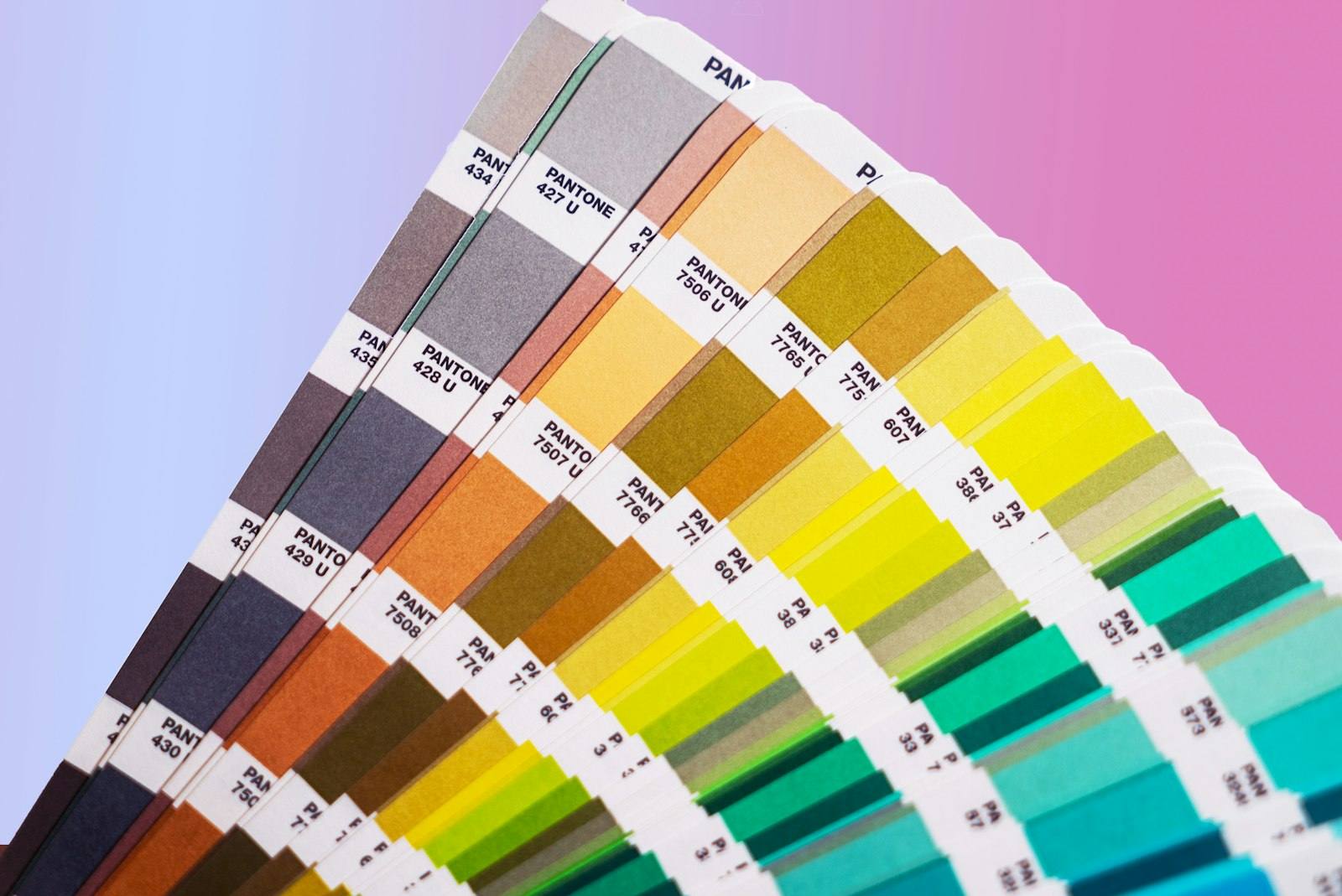
Choosing color palettes: "colorblind-safe" palette considerations
For data visualizations specifically requiring multiple, distinct colors (e.g., a chart with 5 different-colored lines/bars) — certain palettes have been specifically designed (or evaluated) for distinguishability across common CVD types — choosing colors that remain distinguishable under simulated deuteranopia/protanopia (not just under typical vision) is the relevant consideration.
A common "safe" approach: avoid relying primarily on red vs green as the distinguishing pair (given these are the colors most likely to be confusable, for the most common CVD types) — palettes built around blue, orange, and other hues that remain more distinguishable across common CVD types than red-green pairs are frequently recommended as starting points for multi-category visualizations — though, for truly robust accessibility, combining any color palette choice with the non-color redundant signals (patterns, labels, etc.) discussed above remains the more complete approach — palette choice alone, without redundant signals, still relies on color as the sole information channel, just with a "better" (more generally distinguishable) set of colors.
Simulating CVD: a useful design-review step
Various tools/browser features can simulate how a design appears under different CVD types — applying transformations that approximate how colors would be perceived by someone with deuteranopia, protanopia, or other CVD types.
Using such simulation during design review — viewing a design (or specific UI elements, charts, etc.) through a CVD simulation — can reveal "this red and this green, which look clearly different to me, look nearly identical under deuteranopia simulation" — providing a concrete, visual check that's often more immediately convincing (to designers/stakeholders) than abstract statistics about CVD prevalence alone.
How to use the Color Converter on sadiqbd.com
- For choosing accessible color pairs: beyond the contrast-ratio checks (covered in the previous article), consider whether color choices rely on red-green distinctions specifically — and whether redundant, non-color signals (icons, labels, patterns) accompany any color-coded meaning
- For multi-category visualizations: when selecting a palette of several distinct colors, consider testing the palette under CVD simulation (via external simulation tools) — this converter can help you generate/adjust specific color values once you've identified, via simulation, which combinations need adjustment
Frequently Asked Questions
If I design with a "colorblind-safe" palette, do I still need redundant non-color signals (icons, labels, patterns)? Generally, yes, for the most robust accessibility — a "colorblind-safe" palette reduces the likelihood of color-confusion issues, but doesn't address other aspects of accessibility — e.g., a user with achromatopsia (true grayscale vision, though rare, as discussed) wouldn't benefit from any palette choice based on hue distinctions at all — only non-color signals (text, icons, patterns, or, for charts, sufficient luminance/lightness differences, which remain perceptible even in grayscale) would be meaningful for such users. "Colorblind-safe palette" and "don't rely on color alone" are complementary, not interchangeable, practices.
Is the Color Converter free? Yes — completely free, no sign-up required.
Try the Color Converter free at sadiqbd.com — convert between HEX, RGB, HSL, and other color formats instantly.